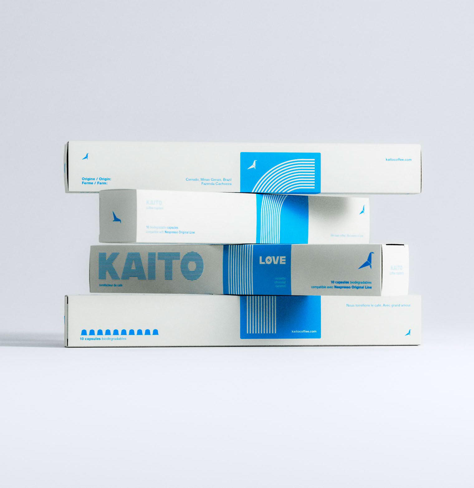
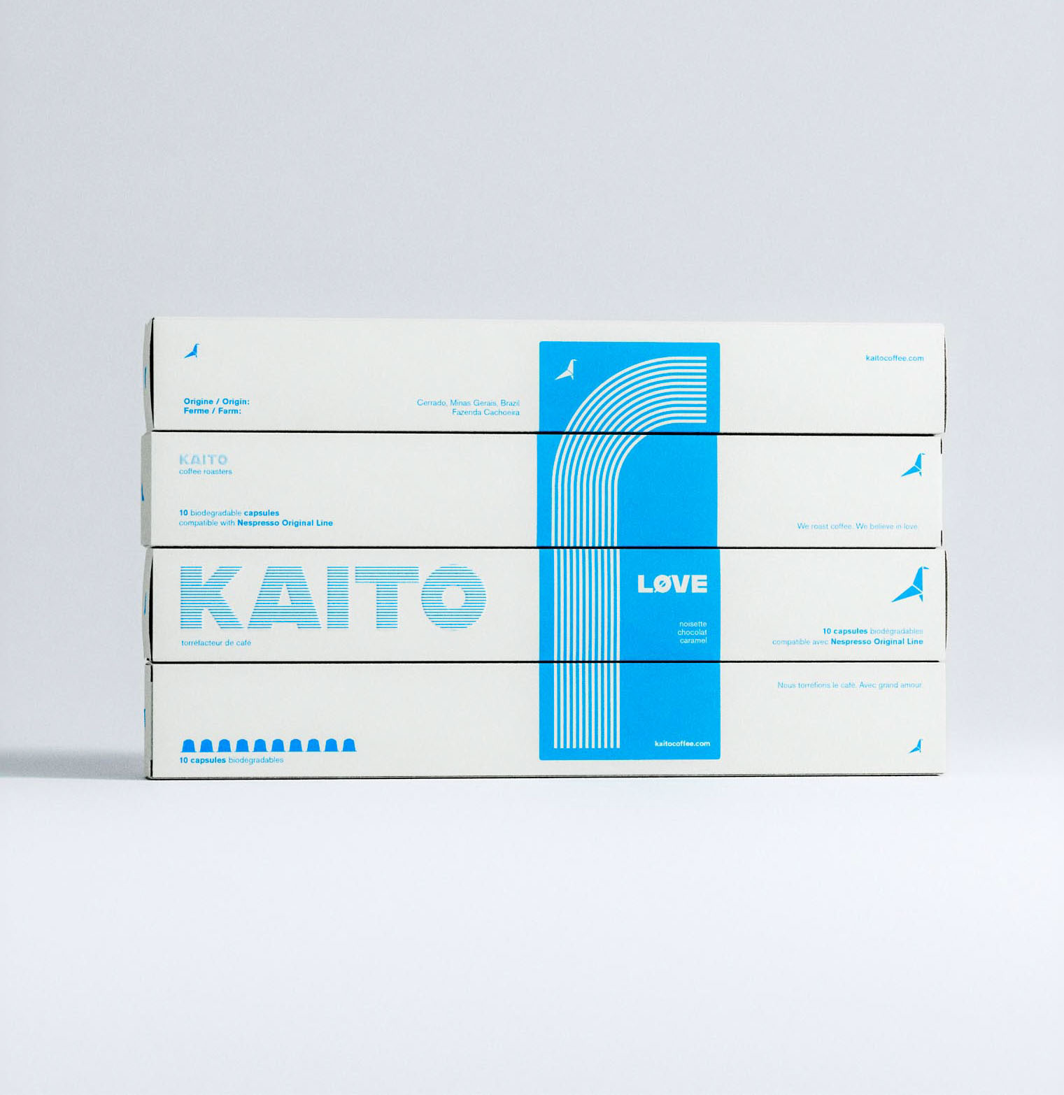
Art of Packaging
⬐


⬐

⬐


⬐


⬐


⬐


⬐


⬐

⬐


⬐


⬐


⬐


⬐


⬐


⬐


⬐


⬐

Design speaks for itself.
Studio works through conversation. Conversation followed by visualization. Visualization discussed in conversation. Branding, aesthetics, messaging,
logic and form.
logic and form.
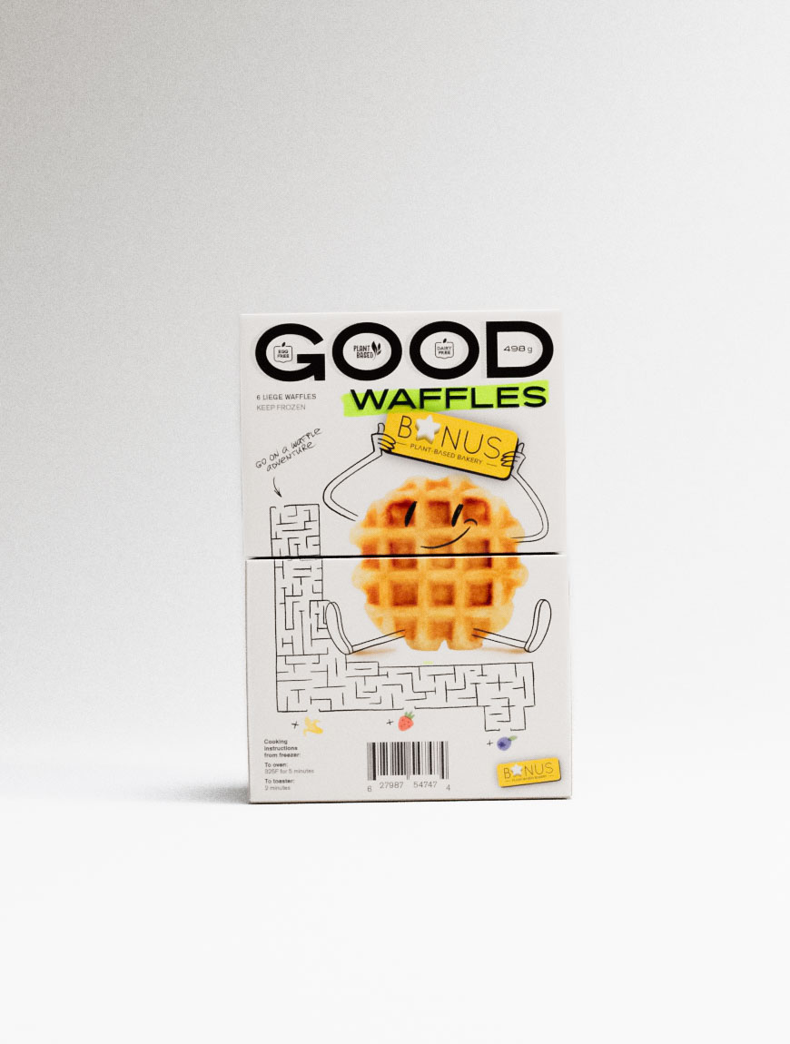
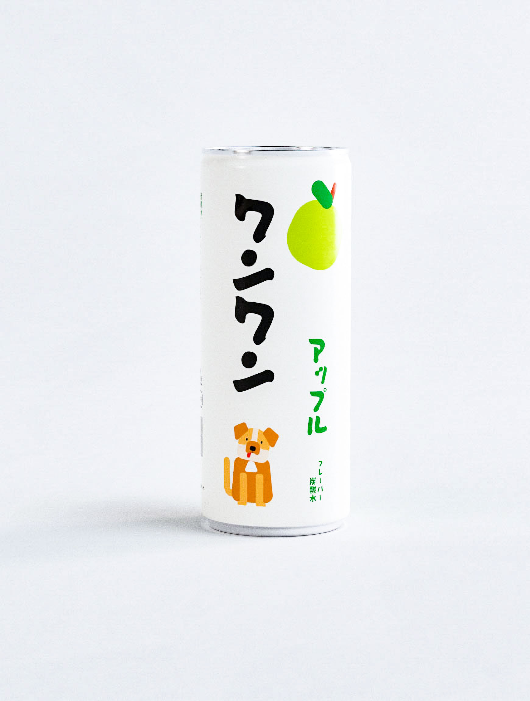
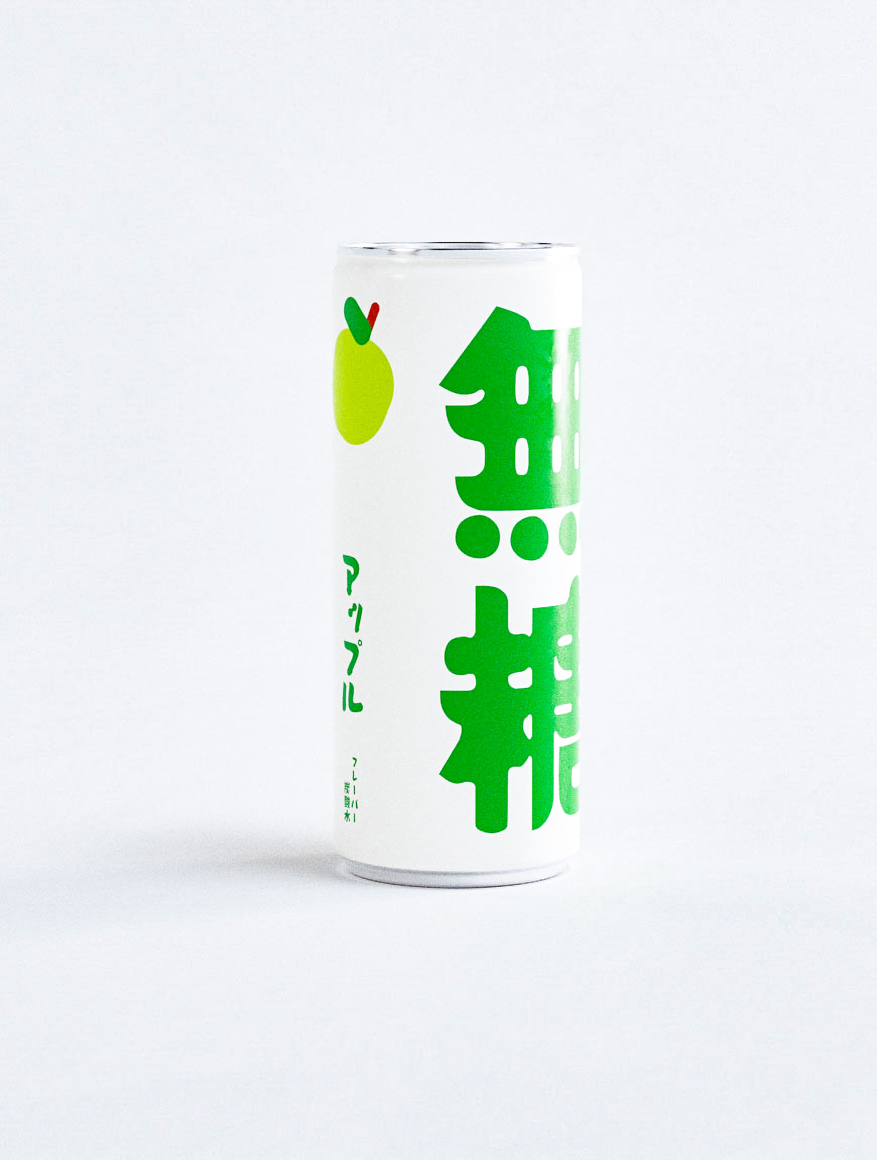
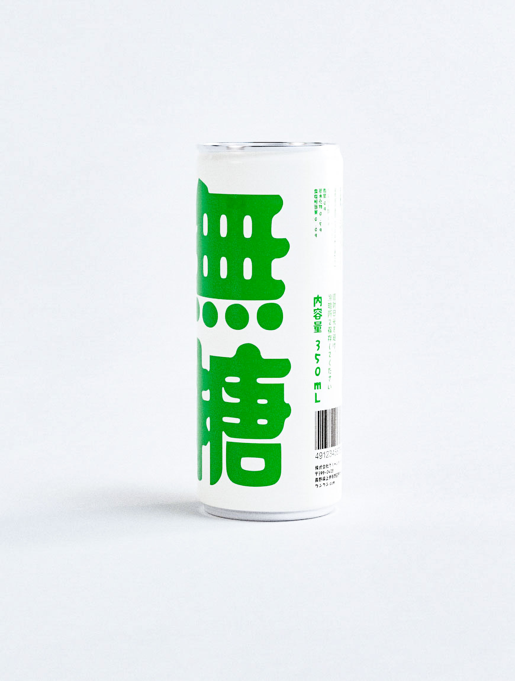
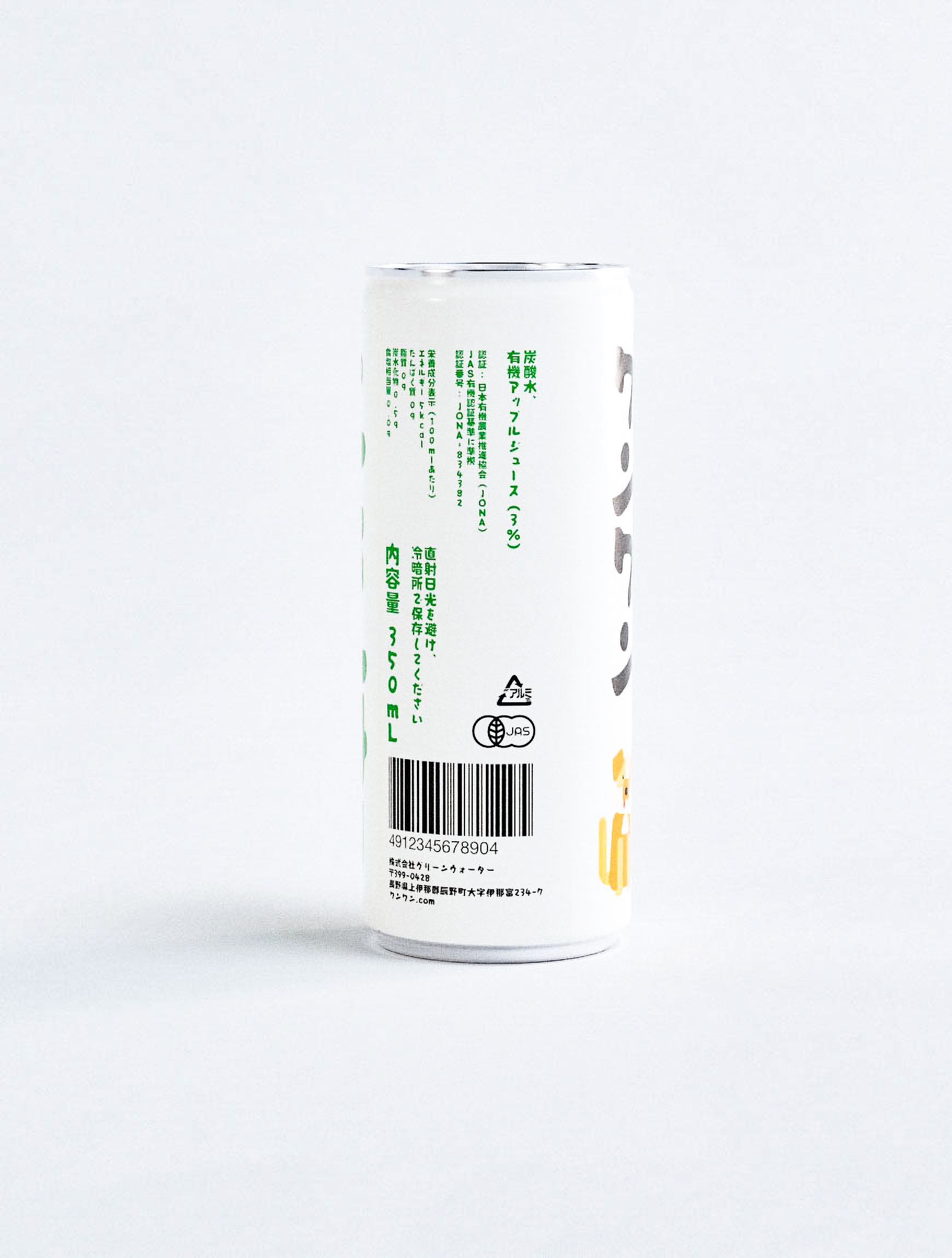
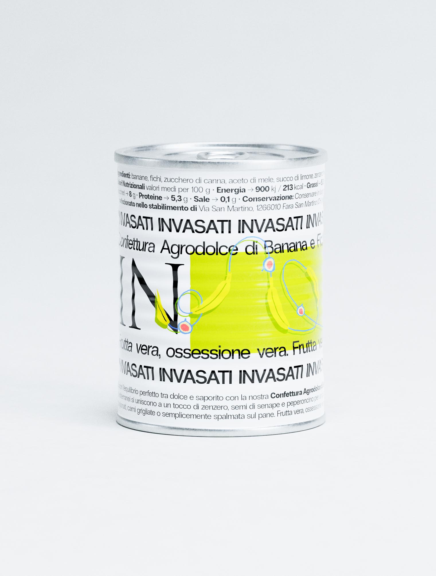
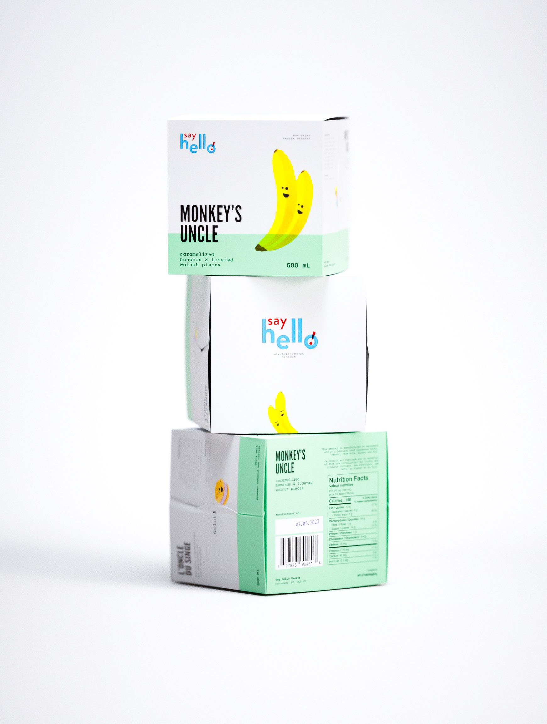
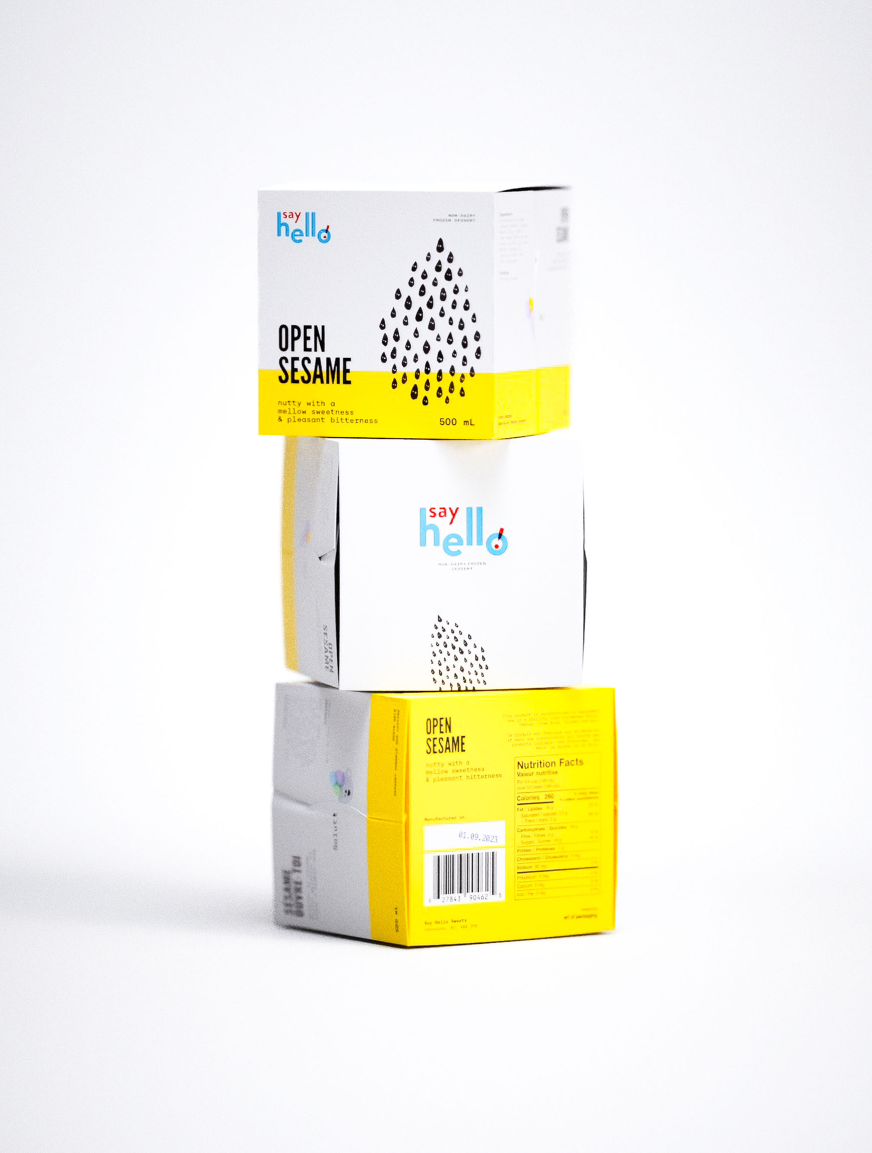
Adorable
authenticity.
⬐


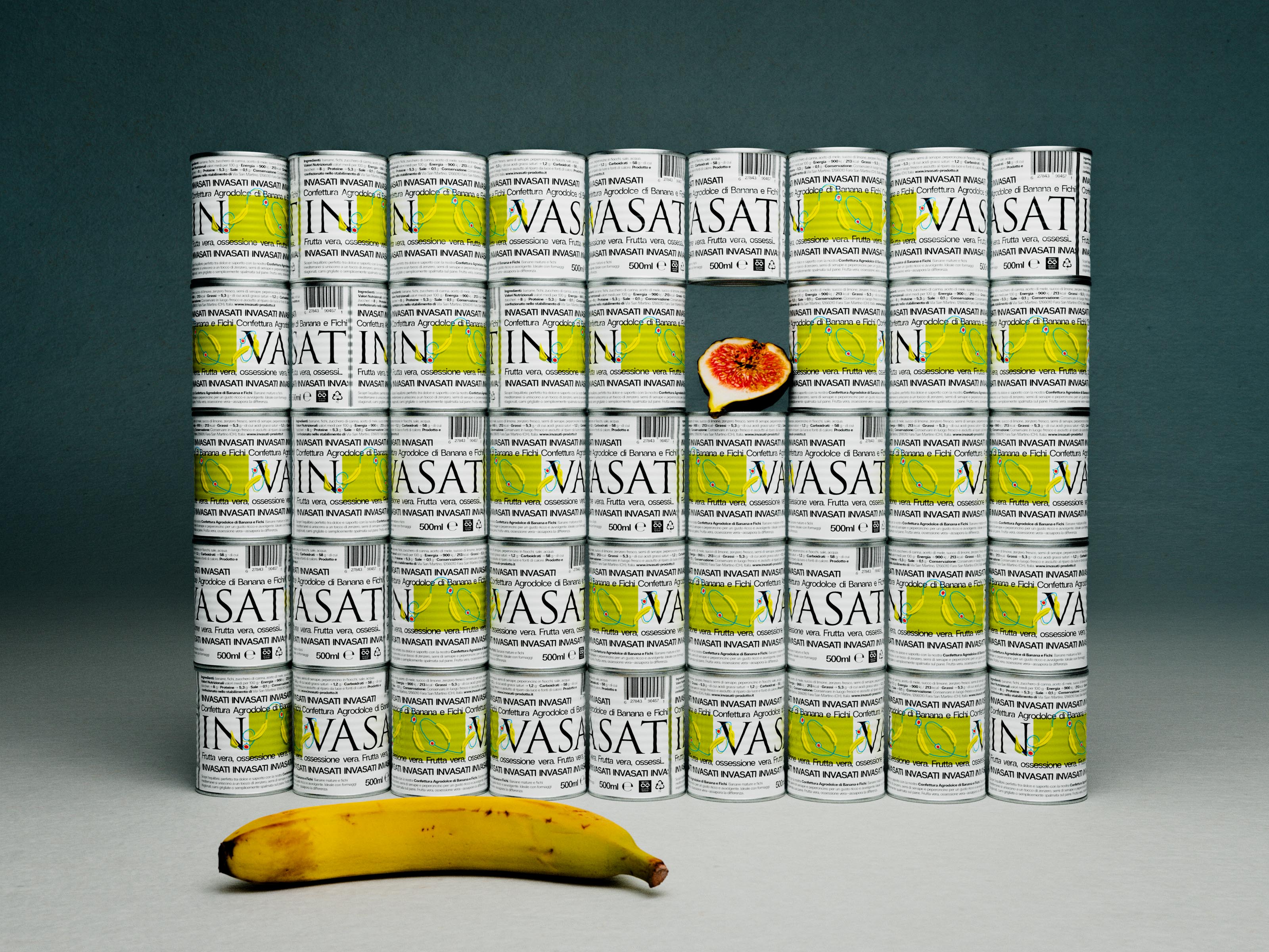
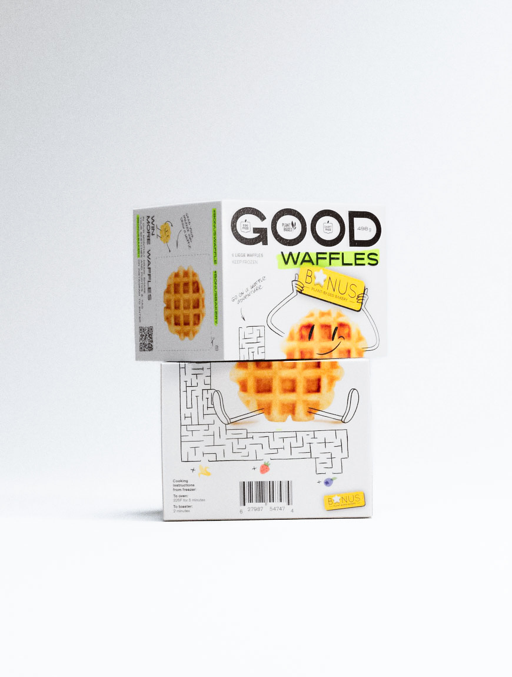
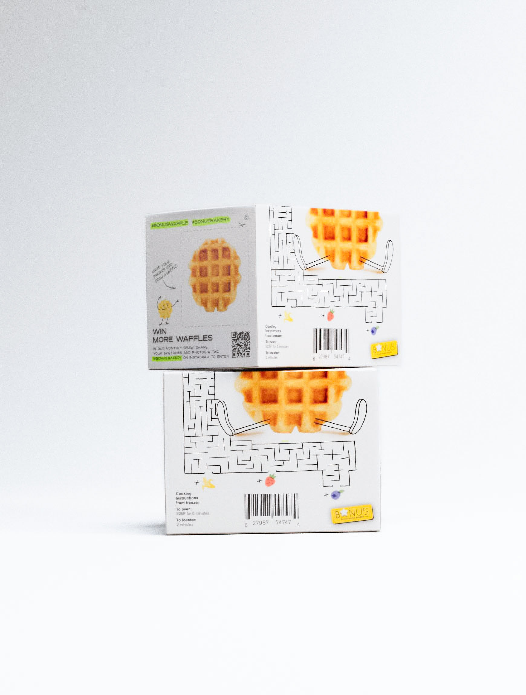
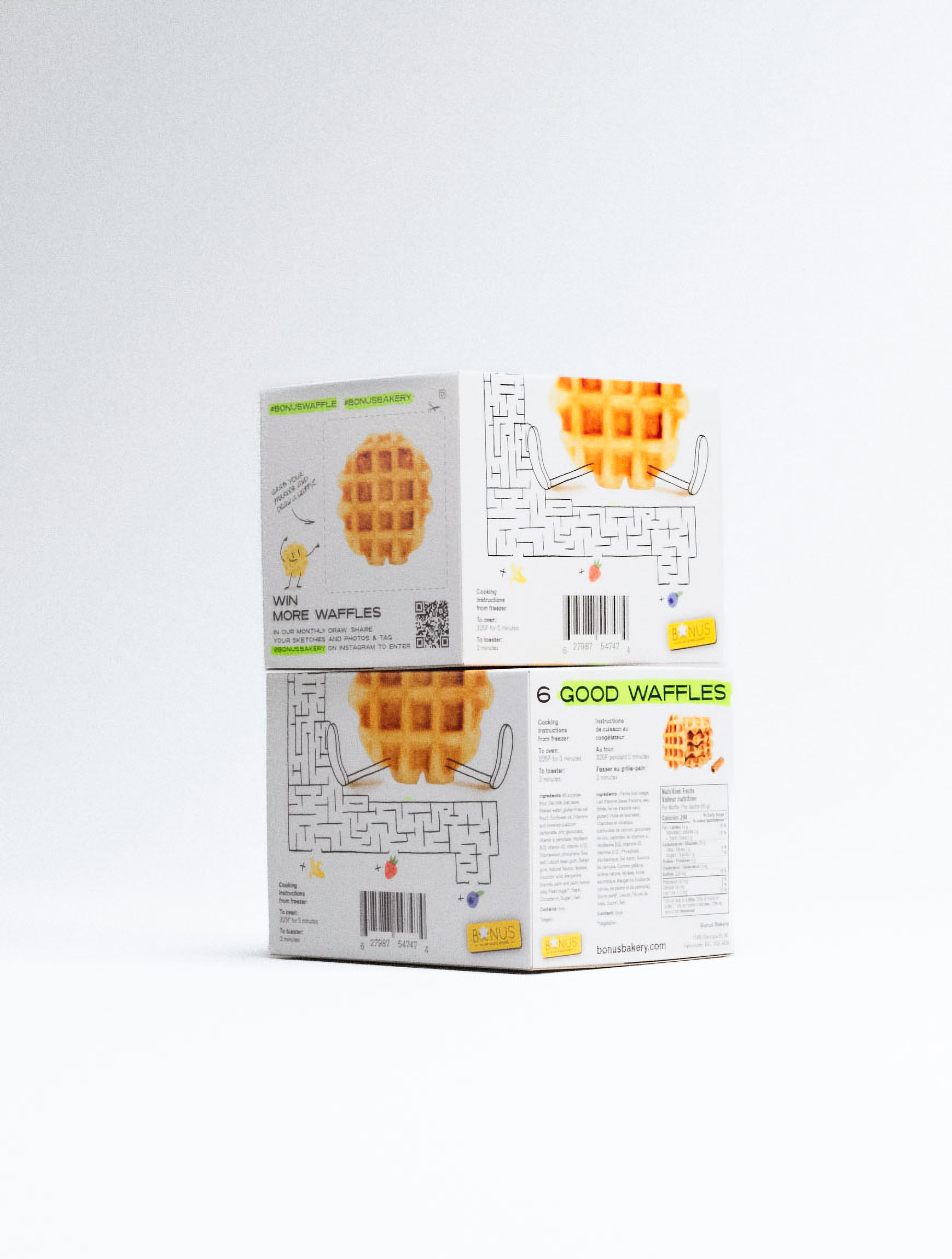
Playing
with food.
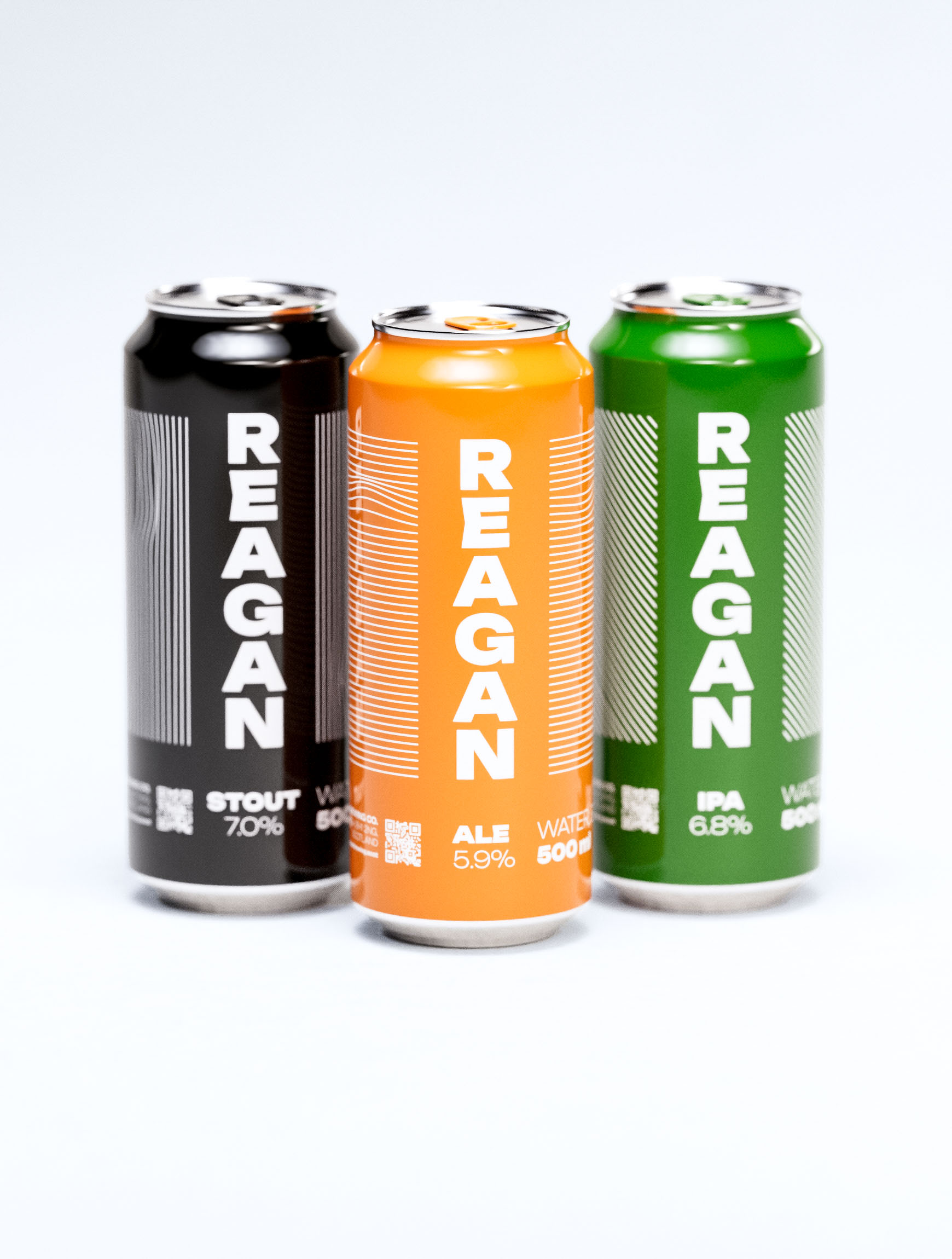
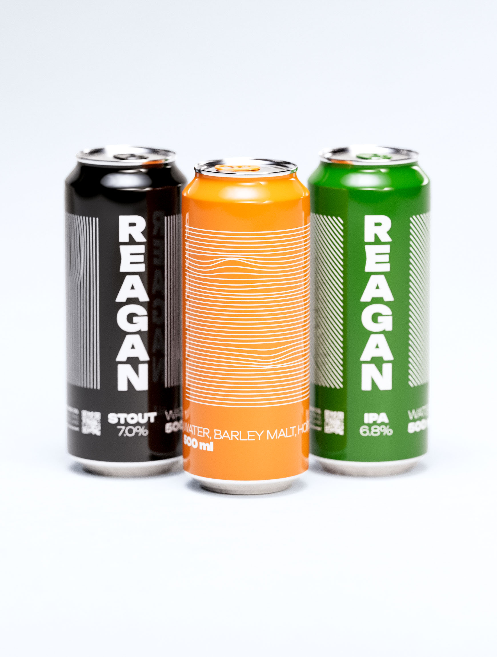
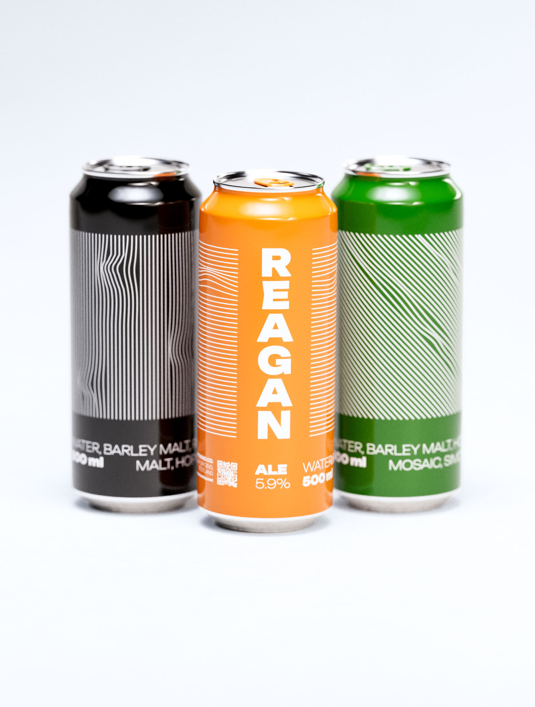
High-speed
finish.

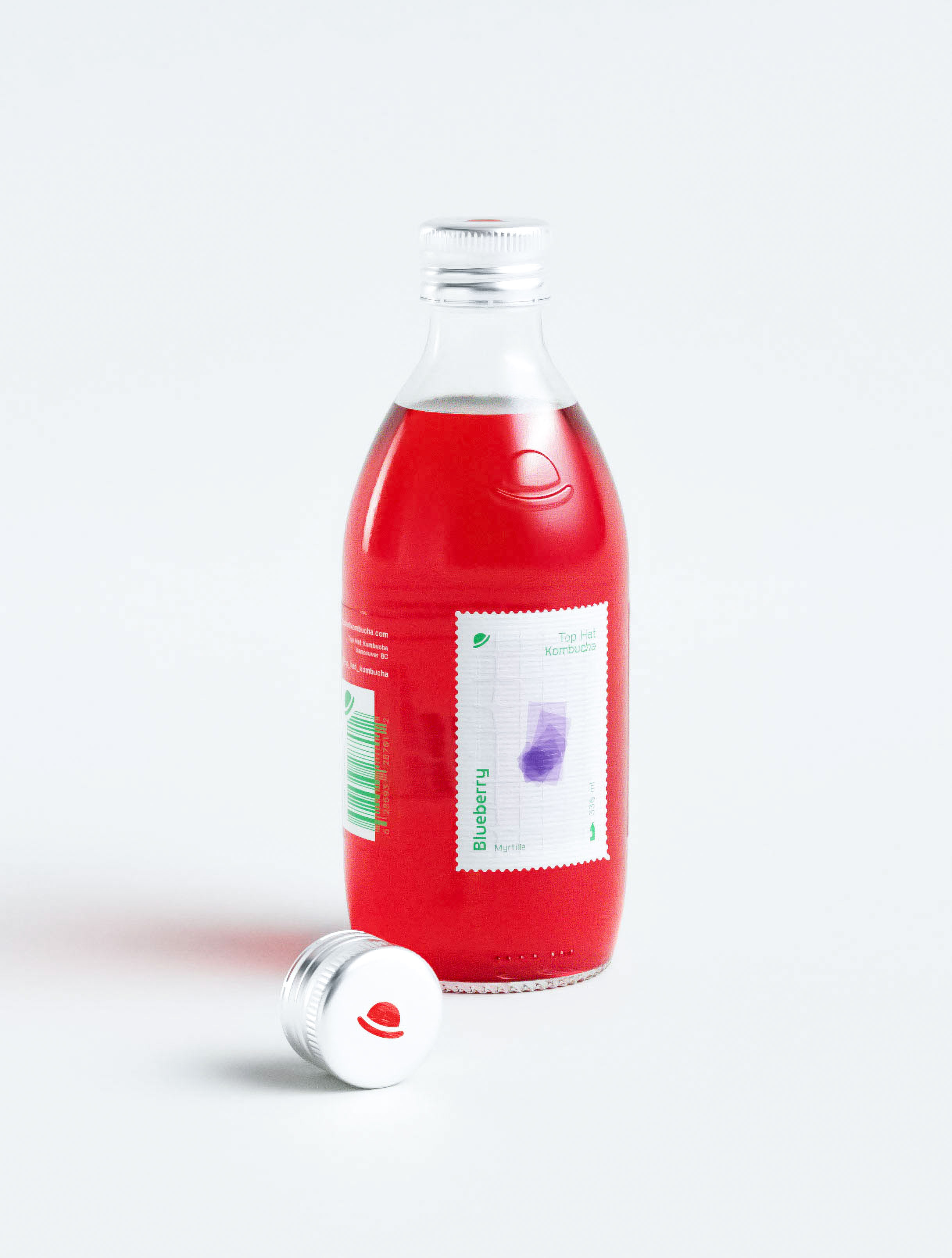
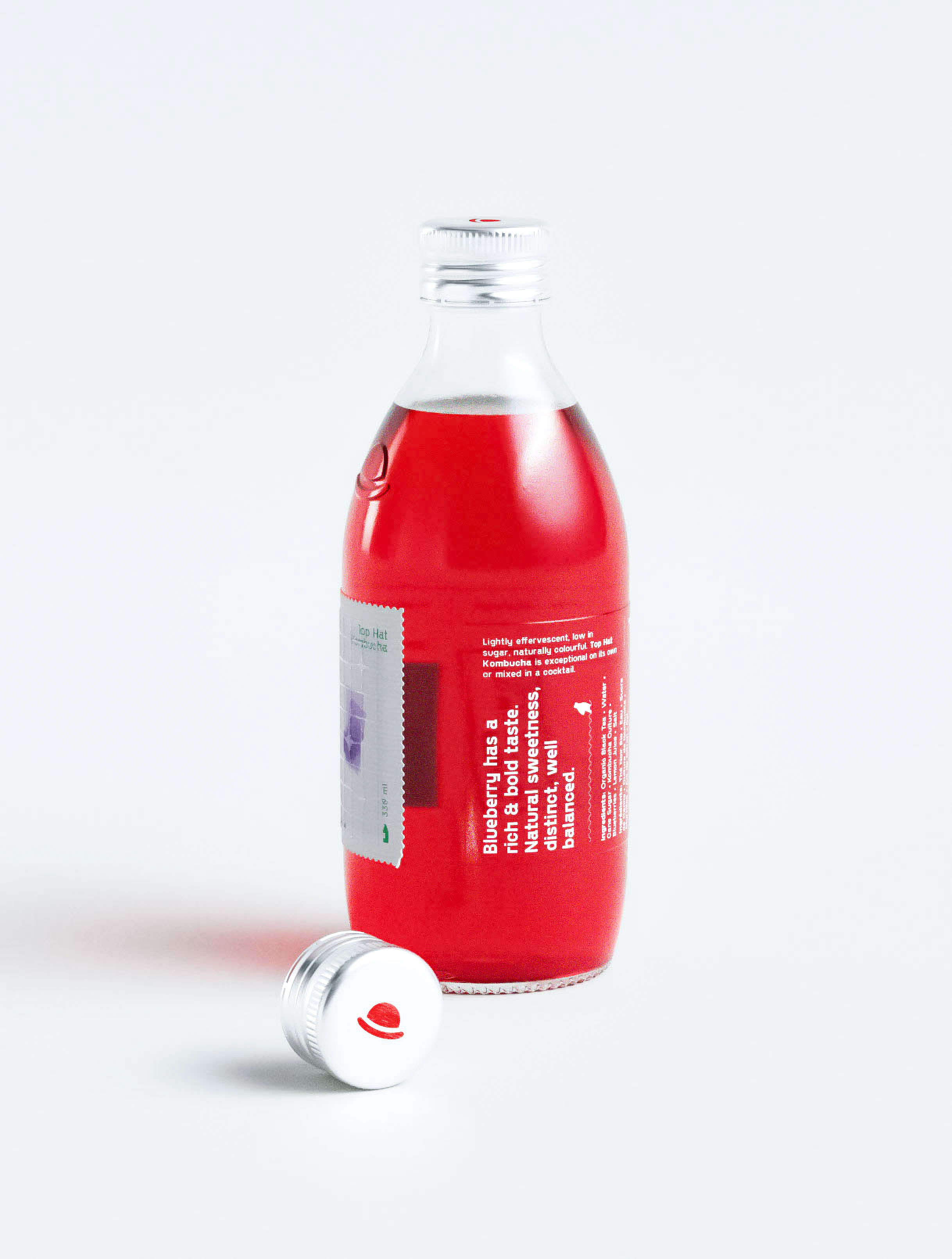
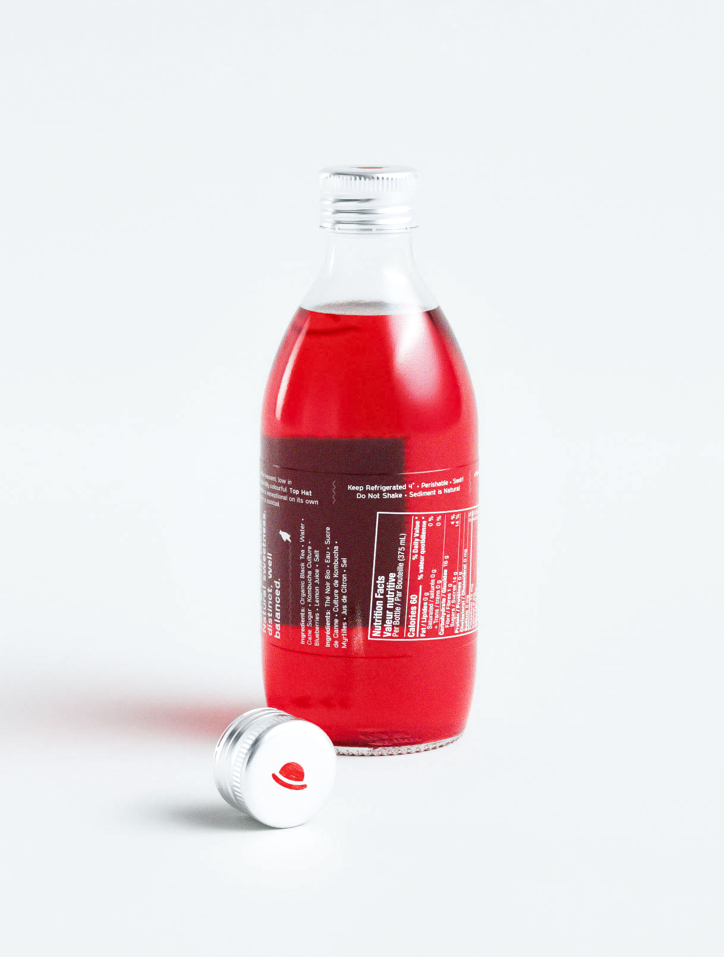
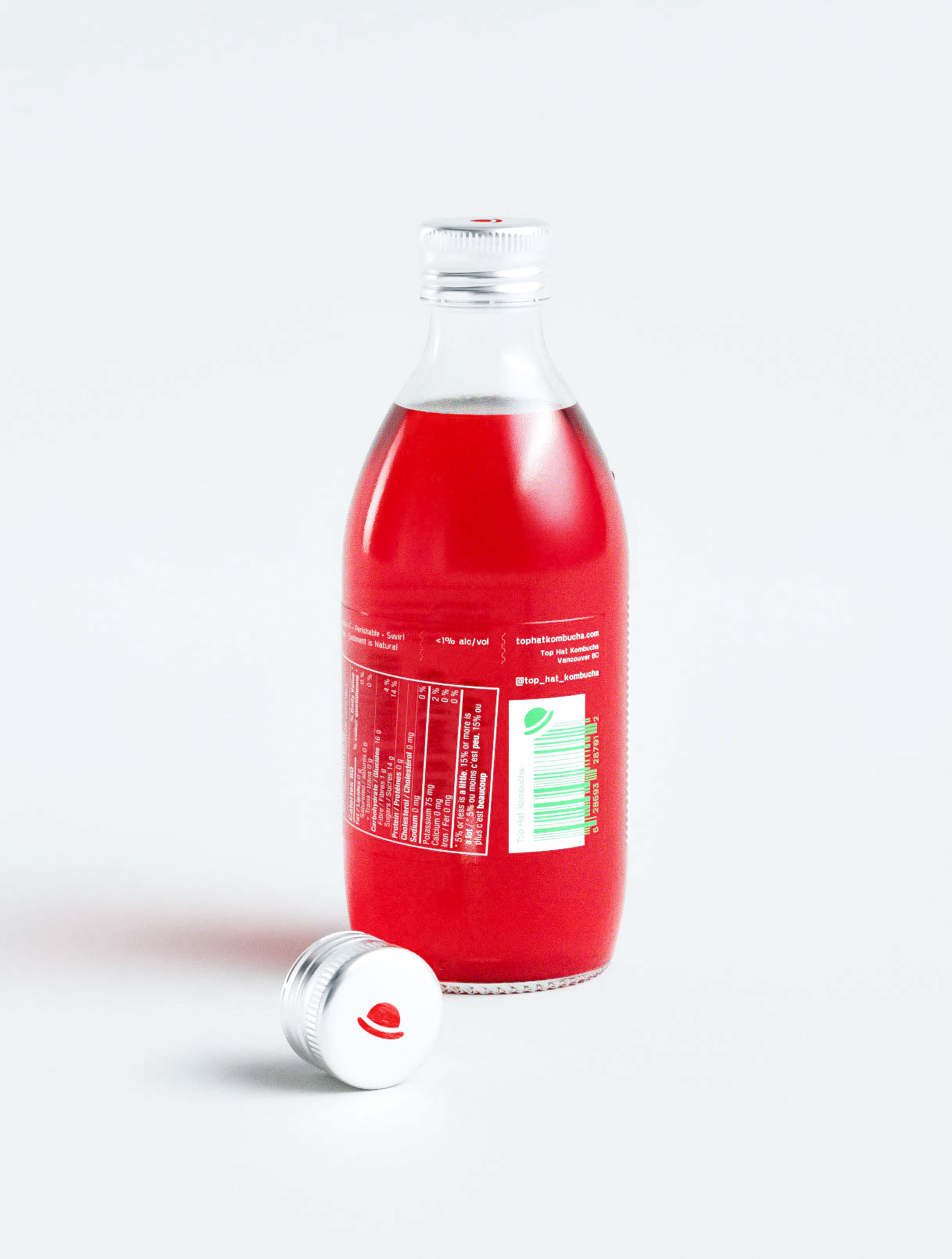
Tactile
& fizzzy.
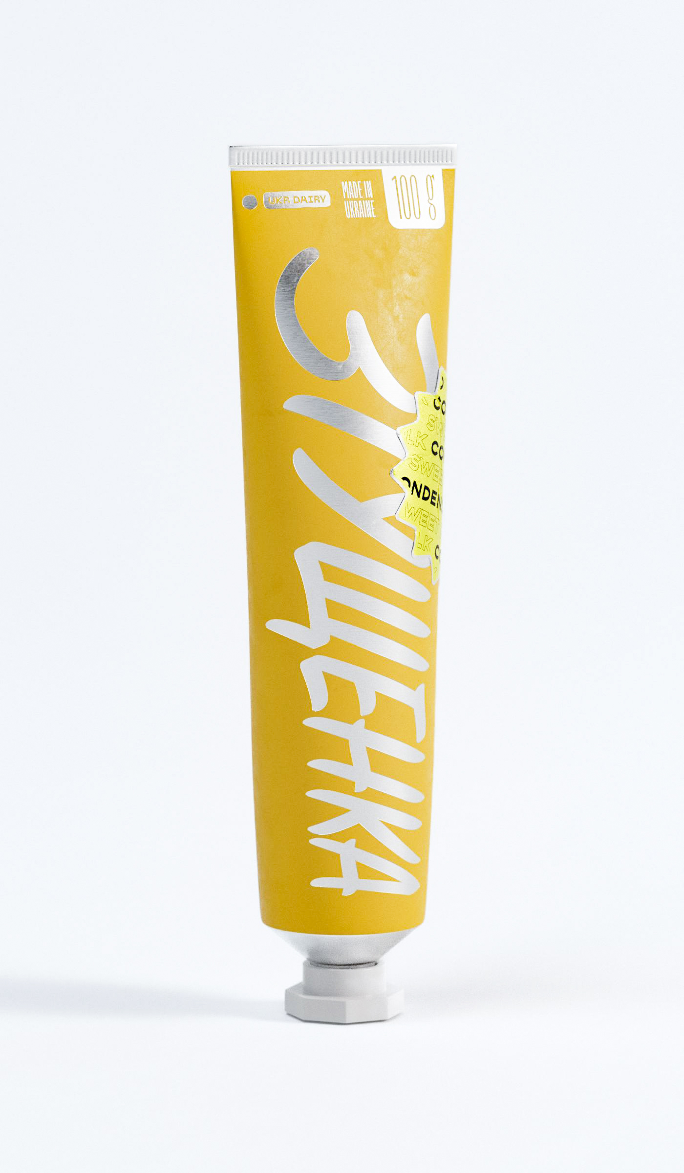
Pocket
candy.

Tastes better
cubed.
Brands and identities.
With a focus on packaging.
With a focus on packaging.